
Motif Nails
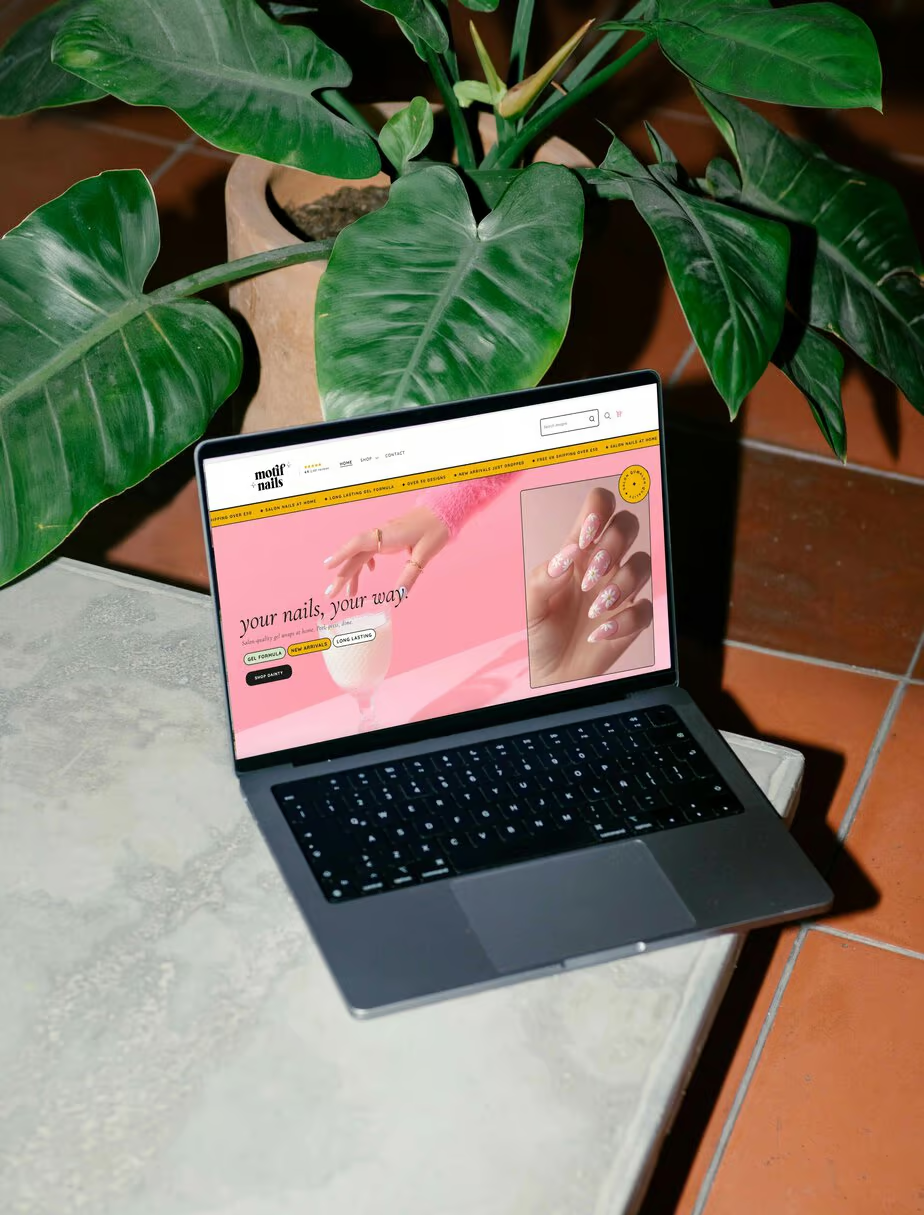
Motif Nails isn’t a real brand. I invented her so I’d have somewhere to put every conversion trick I normally have to talk clients into one at a time. Gel nail wraps, £8 a set, made in Manchester, entirely fictional.
concept build
conversion design
CMS: Shopify
Theme: Free base, fully custom
Product: Nail wraps

01.
I kept having the same conversation on sales calls. I’d say ‘your product page is quietly costing you money’ and the founder would nod politely, because what does that actually look like? Screenshots of other people’s stores only get you so far, and I can’t exactly open a client’s backend and show you round.
So I built my own. Motif Nails sells gel nail wraps at £8 a set, which is a deliberately awkward price. Low enough that a single item order barely covers the postage, high enough that people will happily buy five if you ask them properly. That maths is what decides whether a small brand makes it or doesn’t.
Fictional brand. Real build. Every part of it works.
02. The Challenge
Anyone can make a store look expensive if you throw a premium theme and a page builder app at it. That isn’t the interesting problem, and it isn’t where most of my clients are starting from.
So I set myself three rules. Build it on a free Shopify theme. Leave the Shopify backend completely intact, which means no page builder apps and nothing that falls over the moment Shopify ships an update or the founder adds a product on her own. And make it look nothing like a free theme.
That last one is the hard part. Free themes are perfectly good, and everyone can spot one at forty paces.
03. The Solution
Every section is custom built, and every one of them sits in the theme customiser like any other, so the founder could reorder her homepage on a Tuesday morning without ringing me about it.
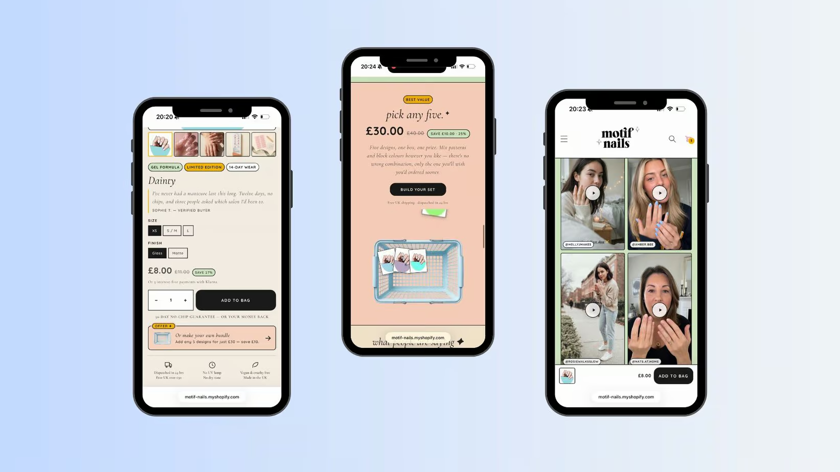
Then I filled it with the things that actually move money. A bundle builder that turns an £8 order into a £30 one, sitting in the middle of the homepage where the tired ‘shop now’ banner usually goes to die. A sticky add to bag bar that follows you down the product page, because the buy button being four thousand pixels above your thumb is a genuine reason people don’t buy. A five star review lifted up above the price, so the first opinion you read about the product isn’t your own. The no chip guarantee parked right next to the button, which is exactly where the doubt is. Customer videos that play as you scroll. Shipping, sizing and returns folded into accordions so the page stays short without hiding anything.
None of it is pushy. All of it is deliberate.
04. The Build
I built it with Claude, which I’d rather say plainly than have you wonder about. I’ve tested AI on my own job before and reported back honestly, so here is the honest report: it is extremely fast at the code and completely useless at deciding what belongs on the page. The strategy, the order of the sections, the reason the bundle builder sits where it sits, that is still fifteen years of doing this.
What the speed bought was the fun. Copy that reveals as you scroll, hover states on every tile, a four step how to that fills in one panel at a time, a marquee announcement bar that doesn’t look like every other marquee announcement bar.
